How the new DxO Wide Gamut helps PhotoLab 6 deliver truer colors and better images (Article only available in English)
For DxO PhotoLab 6, we created our most versatile and flexible color space yet. Here’s how it works and why it’s better for your photos.
Color is one of the most important aspects of any picture and the capacity to reproduce and adjust color to match the photographer's intent is fundamental to any image-editing software. Essentially, accurate color is the foundation on which you edit.
To make better adjustments and provide more intense and lifelike results, DxO PhotoLab 6 brings three major advances in terms of the way it handles color.
- At its heart is a new working color space providing a much wider gamut for accurate reproduction of saturated colors and more headroom for color adjustments like hue, saturation, and luminance.
- The algorithms that manage colors as they pass through your image-editing workflow have been completely reengineered so that they deliver better results in conjunction with the new working color space.
- Finally, a new Soft Proofing mode ensures that the colors and tones that you see on your monitor match what comes out of your printer, or what is displayed on your other devices.
Together, not only do these advances give extra headroom for boosting colors and let you make the most of the latest generation of monitors, but they also allow you to accurately reproduce images throughout your entire workflow — from the second that you press the shutter button to the moment you hang your print on the wall.
From capture, through editing, to printing and sharing, PhotoLab 6 is a revolution in color.

Get to grips with color science lingo
To understand why we created a new wide gamut color space – and why it’s so effective – it’s important to have a working knowledge of color science. Below are some of the main components. If you’re comfortable with color science and just want to know more about how PhotoLab 6 handles color, just click here to skip to that section. Link to below
Color
Color is a sensation that the human eye perceives as a result of light being reflected by an object or emitted by a source. More precisely, this perception occurs as various parts of the spectrum of light interact with the three different types of cone photoreceptor cells on our retina. This stimulation is converted into an electrical signal which we interpret as color.
If all wavelengths present similar levels of intensity, we perceive achromatic colors such as gray or white, but when certain parts of the spectrum dominate, it is perceived as color. When more energy is concentrated in a small part of the spectrum, a color will appear more saturated and intense.
Surface colors
As we’ve already set out, color is not a literal property of objects – it’s a sensation we perceive, resulting from the interaction between reflected light and the cone cells in our retinas. Additionally, the colors we perceive depend on both the incident light (illumination) and the physical characteristics of the objects (reflectivity, fluorescence, etc) we’re viewing. Nevertheless, it makes sense to characterize objects in terms of the color we perceive when looking at them under standard conditions (e.g. bright daylight). We call those surface colors.
Surface colors are only a subset of all the colors that humans can perceive — e.g., they don't include spectral colors. For example, the pure green and blue of the monitor on which you are reading this article cannot be observed on real-world objects. But surface colors are typically what we care about in photography, because we want to reproduce those ‘real world’ colors in prints or on screens.
Spectral colors
If the light emitted from a source consists only of a single wavelength — i.e., a single spectral value — it is perceived as one, highly intense color. These spectral colors do not exist naturally but some can be produced by lasers.
Color space
Color space is the term we use for the organization of colors. That organization results in a defined range and uses a mathematical model to represent colors. Color spaces typically organize colors along three axes, which ties in with the human eye’s three different types of cones (those which are responsive to red, green, and blue light).
The most common family of color spaces is therefore RGB where colors are created through a blend of three primary colors: red, green, and blue. But these primaries are different for each device. For example, different screens use different chemical components in their color filters. To counter this, there are standard RGB color spaces such as sRGB, Adobe RGB, and Display P3, each of which defines its own distinct set of primaries.
XYZ and CIE color spaces
There are also color spaces that are defined independently of any device, such as the XYZ space designed in 1931 by the International Commission on Illumination (abbreviated to CIE from its French name, Commission Internationale de l'Éclairage). This space attempts to model color perception along three axes: X, Y, and Z.
The illustration below shows the spectral power distribution of the light reflected by two different objects — a piece of paper and a tomato – when the objects are illuminated under daylight. Each graph also indicates the corresponding surface color expressed as XYZ values. To the human eye, the paper is perceived as white, while the tomato is perceived as red.
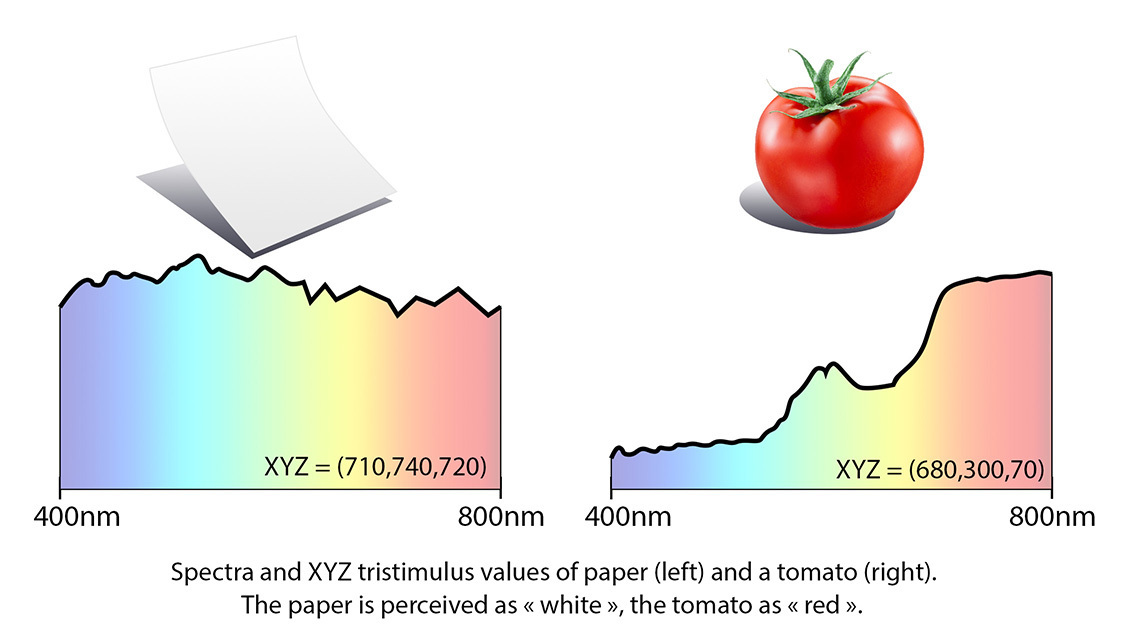
Fig 1: The light reflected by two objects, shown in graph form.
Gamut
A gamut is the range of colors that can be reproduced by a given monitor or printer, or the colors that can be represented within a certain color space. For printing, gamut depends on both the inks and the paper being used. The larger the gamut, the more colors a device can reproduce.
If you are soft proofing an image using a color profile for a printer, your software might notify you that certain colors in your image simply cannot be reproduced by the printer — they are “out of gamut.” See below for more on soft proofing and why it’s important.
Wide gamut
Wide gamut is a loose term that describes any device or color space that can reproduce more colors than average. Since most of today’s monitors use the relatively small sRGB color space, any color space exceeding the gamut of sRGB tends to be called “wide gamut” by the relevant marketing team. Not all wide gamut devices are equal, however; the term can describe color spaces that are slightly larger than sRGB through to those that are far, far bigger.
Chromaticity
Chromaticity is a measurement that distinguishes different colors of equal luminance. It’s therefore commonly used in charts that illustrate color space. Several color spaces organize color so that one axis represents luminance, and the other two axes represent chromaticity, for instance in the form of hue and colorfulness.
The CIE has derived a chromaticity diagram from their XYZ color space where colors are represented along two axes, x and y. This diagram is popular for comparing color gamuts, mainly because it can be presented more easily than a three-dimensional chart.
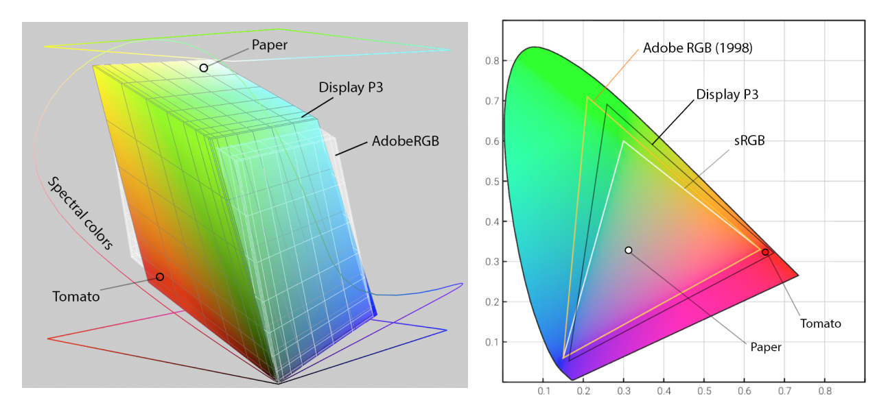
Fig 2: Comparison of the AdobeRGB and Display P3 color spaces in the CIE XYZ color space (left) and CIE chromaticity diagram (right). Notice how, although AdobeRGB and Display P3 are of similar size on the chart, neither is a subset of the other – AdobeRGB contains more cyan, while Display P3 contains more red and yellow.
Color profile / ICC profile
A color profile – also called an ICC profile because the format was standardized by the International Color Consortium – characterizes the color space of a specific device, typically a monitor or a printer. They are normally supplied by the vendor or can be created by the user by measuring the device, for instance by using a colorimeter.
Color management
Color management is the process of converting colors from one color space to another while preserving the perception. Typically, when displaying an image on your calibrated screen that has been saved in a standard color space such as AdobeRGB, the color management system will convert the colors from AdobeRGB into XYZ (called the “profile connection space”) and then from there to the color space defined by the color profile of your screen.
Sensor native color
Sensor native color is what results from the interaction between light and the sensor of a digital camera. Strictly speaking, it’s not “color” because color is a human perception, but since camera sensors used in photography are designed to perceive color in a similar way to the human eye, the digital values they produce resemble those colors.
RAW files contain pixel values in sensor native color, so converting RAW files into finished photographs involves converting the former into actual color. The parameters required for this conversion are typically provided either by the image file’s metadata or directly by the RAW converter itself.
Because the sensor only approximates human photoreceptor cells, this conversion is also an approximation. Its precision can be improved by taking the light source into account. That is why at DxO we calibrate these parameters for every camera for both daylight and tungsten lighting.
Working color space
The working color space is internal to software, and not something you’ll experience visually when you edit an image. It’s the space within which the processing takes place. To be displayed on a monitor, the image needs to be converted from the working color space to the color space of the monitor.
In DxO PhotoLab, denoising and lens corrections are performed within sensor native color in order to achieve the best results. However, the image is then converted into our working color space, where red, green, and blue are defined according to human perception, rather than the color filters of the sensor. This ensures that editing tools such as HSL sliders, ColorWheel, or ClearView Plus are consistent, regardless of which camera has been used to take an image.
Output color space
Finally, the output color space defines how you save your images and is typically governed by what monitors can display. The most common is sRGB, and this is the standard for the World Wide Web, which uses the primaries as defined by the television standard Rec. 709. Other typical output color spaces include AdobeRGB, which is widely used in the prepress community, and Display P3, which is used for the displays in Apple’s recent desktop and notebook computers.
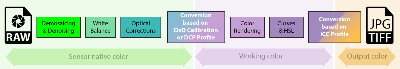
Fig 3: The different color spaces used in DxO’s RAW conversion pipeline
Why DxO PhotoLab 6 has moved to a wide gamut
Wide gamut monitors can display more vivid color than those with a standard gamut like sRGB. Whether this is useful depends on the content of an image, because under normal lighting conditions, even objects that we perceive as very colorful – for example red tomatoes or a blue sky — fit within sRGB.
However, there are a lot of colors that do not fit into sRGB. These are usually encountered on artificial objects such as brightly colored sportswear or from artificial lighting such as laser stage lights. On a wide-gamut monitor, these colors can be reproduced more accurately than on a regular monitor.
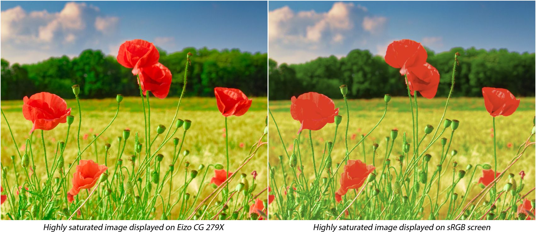
Fig 4: Comparison between wide gamut and sRGB monitors. Notice how, due to some of the values being out of gamut on the sRGB monitor, detail in the poppies’ petals is lost.
To fully exploit the capacity of a monitor, photo editing software should use a working color space with a gamut which at least matches that of the monitor. When we created our first RAW converter almost two decades ago, it was safe to assume that monitors would be either sRGB or – for the high-end, color-critical models – AdobeRGB. Choosing AdobeRGB as our working color space seemed to cover all needs, so that is what we did.
Since then, technology has evolved and monitors have improved. With Display P3 monitors used in recent Apple computers, their native red is “redder” than the “reddest red” that DxO PhotoLab 5 could produce. In order to simulate pure AdobeRGB red on such a monitor, the color management system must dilute it slightly and make it less intense by adding a small amount of blue. The much wider working color space of DxO PhotoLab 6 — which comprises both AdobeRGB and Display P3 — solves this and can produce pure, native color on such a display.
The same applies to printing. Certain printers and printing services can produce colors that are outside of AdobeRGB, and DxO PhotoLab 6 allows you to harness their full potential.
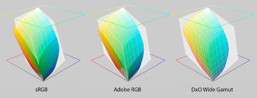
Fig 5: The gamut of WhiteWall’s Ultra HD photo prints (in color) in different RGB color spaces (in gray): sRGB (left), AdobeRGB (center) and DxO’s new working color space (right).
At the other end of the imaging workflow is the camera. Camera sensors do not actually have a gamut. Instead, they’re sensitive to every wavelength in the visible part of the spectrum and high-end sensors only differ from low-end models in that they better approximate the spectral sensitivity of the human eye. Thus, every color in a scene can be observed and recorded in the sensor native color space.
However, when converting from sensor native color into a working color space, as you do when developing RAW files, it may happen that a color cannot be represented. Essentially it has fallen outside of the working color space’s gamut. Having a working color space with a wider gamut therefore allows us to preserve more colors, just as they were recorded by a camera’s sensor. In combination with a wide gamut monitor and printer, the scene can then be captured, processed, and reproduced without losing its original intensity.
Finally, working in a wider color space gives photographers more headroom for adjusting the color in their images. For example, PhotoLab’s ClearView Plus tool can produce certain colors that do not fit within AdobeRGB. But with DxO Wide Gamut they are preserved. You can therefore use the ColorWheel or a Control Point to desaturate these colors, and bring them back into gamut.

The problem of ‘clamping’ out-of-gamut colors
What does falling outside the color gamut mean precisely? Let’s start by going back to the idea of color values.
The simplest way to describe out-of-gamut colors and how they are managed is to think in terms of 8-bit images. In an 8-bit image, each of the red, green, and blue pixel values can range from 0 to 255. 255/0/0 would be the reddest possible red, while 128/128/128 is mid-gray.
Mathematically, a color would be out of gamut if at least one of the three RGB components had negative values. But obviously, this wouldn’t make sense as a monitor cannot emit negative light. A color could also be out of gamut if some of the values exceed the maximum. That, again, is not technically possible as a monitor cannot display values brighter than its limit.
One way of handling out-of-gamut colors is to simply clamp them to the closest allowed values, for example, setting them to 0 if they’re below the low limit, or to 255 if they’re above it. This is what many color management systems do, but they can produce unwanted results.
What do we mean by unwanted results? This ‘clamping’, whereby one of the RGB components is altered while keeping the others unchanged, means altering the hue. A more sophisticated method involves preserving the hue while accepting a reduction in saturation, and this generally yields better results. Unfortunately, even this approach can cause some problems. For instance, textures flatten as the contrasting color within those areas falls completely out of gamut.
How DxO’s reimagined color processing fixes the problem
For DxO PhotoLab 6, we’ve worked to ensure that all of the luminance details captured by the sensor are maintained throughout your workflow. For the best possible quality, our reengineered algorithm is designed to act in two stages: first when converting from sensor native color to working color, and then when converting from working color to output color.
As the image moves from sensor native color to working color, in order to avoid losing any of the details originally captured, the algorithm smartly analyzes the colors in each image and then desaturates – only if necessary – highly saturated colors by a small amount. This applies even to those inside the gamut, and is done in order to make headroom for those outside the gamut. Thanks to this algorithm, we can therefore produce images that contain all luminance details that were captured by the sensor — and although they appear less colorful than in the original scene, all of the tonality and detail is maintained.
The first stage (Protect saturated colors in the Color Rendering palette) has been reworked and improved compared to PhotoLab 5, the second stage (Protect color details’ in the Soft Proofing palette) is entirely new.
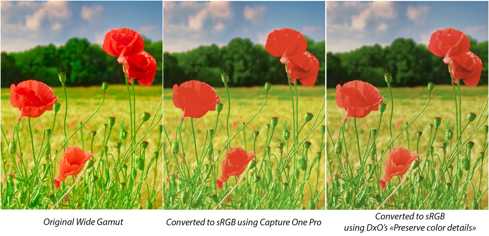
Fig 6: Comparison when converting to sRGB from original image
How DxO PhotoLab 6’s Soft Proofing mode keeps colors consistent for output
Most of the time, photographers use wide-gamut monitors which, in combination with software such as DxO PhotoLab 6, allow accurate reproduction of most of the colors contained in images. But when it comes to sharing images, either online or as physical prints, these output media have different gamuts that are typically a lot smaller.
A smaller gamut means that colors can look different between what you see on your monitor and what you get in print, or after exporting to other devices. Those changes in color also mean that delicate textures can be lost. Wouldn’t it be better to take that output gamut into account during editing? This is where soft proofing comes into play.
Soft proofing allows photographers to get an on-screen simulation of what an image will look like when displayed or printed on a certain device. It gives an overview of the outcome by emulating the less saturated primaries of a standard screen, or the inks of the printer and the way they physically react with paper.
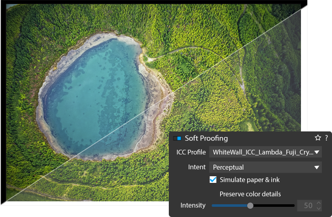
The conversion properties are embedded in specific color profiles created for each combination of printers/inks/papers and are usually provided by printing services, device manufacturers, or are created for personal printers.
Once downloaded and installed, users can select a specific profile to be used as a soft proofing base, and after activating the option in their application, can adapt their color adjustments according to the displayed results in order to achieve the desired image. This can include adjusting color casts, or contrast and luminance issues in areas such as shadows or highlights.
Though it cannot completely replace a hardcopy proof, soft proofing is crucial for saving time and money that would otherwise be wasted in the trial and error of getting a print acceptably close to the original image.
However, soft proofing isn’t a free pass to perfect output. It's important to remember that soft proofing mode, as with any settings dedicated to color accuracy, requires editing on a calibrated monitor and in a consistent viewing environment.
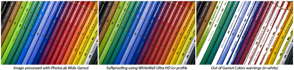
Fig 7: DxO Wide Gamut color space and out-of-gamut colors
How we designed our new working color space
As explained, the working color space used by a RAW converter determines the colors it can produce. The more, the better — correct?
At the same time, as its name suggests, the working color space should allow you to work with color and manipulate it in an intuitive way. For example, turning up the blue saturation in the DxO ColorWheel should produce some color that you perceive as very blue.
If it was only about reproducing color in the scene, the best working color space would be XYZ, as it contains every color that can be perceived by the human eye. However, while this color space was designed to express the color stimuli generated on our retina, it does not follow our perception of color as effectively as when using RGB color spaces. Deploying XYZ as a working color space would make our color adjustment tools behave strangely and make photo editing very challenging.
Among the RGB color spaces used today, the one that stands out is ProPhoto RGB. It covers a very large percentage of colors, and certainly all that are useful in practice. It achieves this through a trick: it uses imaginary colors for its blue and green primaries — points in the XYZ space that lie beyond spectral colors. Mathematically, this trick allows ProPhoto RGB to obtain certain spectral colors as a blend of the ProPhoto RGB primaries. The downside is that pure blue or pure green in this color space do not correspond to anything that physically exists or that any human has ever perceived.
When experimenting with our new algorithms for DxO PhotoLab 6 we found that even when you turn all saturation sliders up to 11, it is more intuitive to obtain results that tend toward spectral colors — and not beyond.
The diagram below shows a comparison of the hue and saturation between sRGB and ProPhoto RGB. The circles show all of the RGB values contained in each color space. The looping line symbolizes spectral colors, from a wavelength of 380 nanometers through to 750 nanometers — the most saturated colors that exist.
The gray dots represent all of the surface colors that can be observed in the real world. Since there are no surfaces that reflect light at a single wavelength, these surface colors are far less saturated than spectral colors. The sRGB color space on the left does not contain any spectral colors and you can see that some surface colors also lie outside of this color space.
The ProPhoto RGB color space on the right is far larger and easily contains all of the surface colors. However, while every RGB value in sRGB corresponds to some color, part of ProPhoto RGB lies outside of the spectral colors and corresponds to something that doesn’t exist. While fully saturated magenta, red, yellow, and cyan correspond to actual colors, fully saturated green and blue correspond to imaginary colors. This can make ProPhotoRGB counterintuitive when it comes to editing photographs.
For this reason we decided to design an RGB color space with the widest possible gamut that can be achieved utilizing spectral colors as primaries. The result is a color space that includes close to every color that can be reproduced on the best monitors and printers available today, and encompasses all of Pointer’s Gamut, the 4089 real-world surface color samples collected by scientist Doctor Michael R. Pointer at Kodak Research in 1980. link to https://onlinelibrary.wiley.com/doi/abs/10.1002/col.5080050308
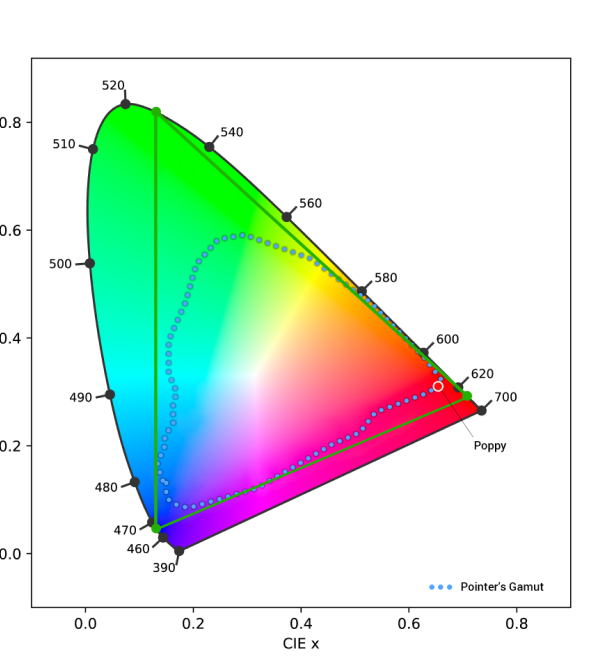
Fig 9: DxO Wide Gamut (the green triangle) encompasses every possible color that a photographer might encounter in nature
The DxO PhotoLab 6 working color space uses spectral colors as its primaries. It is big enough to contain all real-world surface colors, and it achieves this without imaginary colors — i.e., every combination of R, G, and B in this color space represents an actual color.
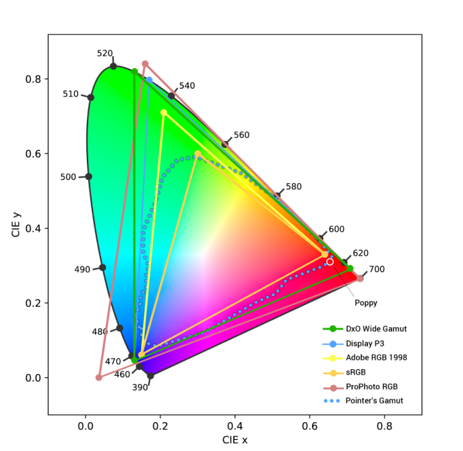
Fig 10: DxO Wide Gamut (DPL6) vs AdobeRGB (DPL5 and older) vs sRGB, DisplayP3, and ProPhoto
DxO Wide Gamut: An intelligent compromise
We believe that this color space, which is quite similar to the television standard Rec. 2020, provides the best possible trade-off between preserving as much color as needed and allowing users to manipulate color in a way that feels natural and intuitive. Combined with our gamut-squeezing algorithm and soft proofing tools, it allows photographers to reproduce any color they may encounter, as closely as possible to the original, without ever losing details.
DxO PhotoLab 9
RAW-Bildbearbeitung in Perfektion